When you push open the doors of a Carrefour hypermarket, you walk under this red and blue logo without thinking about it. The sign is part of the decor, like the shopping carts and self-checkouts. However, the Carrefour logo hides a letter that the vast majority of customers have never noticed, and its design history dates back to a time when French retail was inventing its visual codes.
The negative space of the Carrefour logo: a concrete graphic technique
We often hear about a “hidden letter” or “secret” regarding the logo. The mechanism is actually an identifiable design process: the negative space between two colored shapes forms a white C. Two arrows, one red pointing to the right and the other blue pointing to the left, meet in the center. The white space that remains between them takes the shape of the brand’s initial.
This is not a coincidence or a happy accident. The graphic designer structured the two colored masses so that the space between them produces a readable letter. The eye first captures the arrows (red and blue attract the gaze), then the brain can, or cannot, reconstruct the C. Most people see the arrows without ever isolating the letter because our perception prioritizes solid shapes.
To document the origin and symbol of the Carrefour logo, we can go back to 1966 and the design work led by graphic designer Jacques Daniel in collaboration with Etienne Thil, then the first director of communication for the brand. The brief was clear: translate the name “Carrefour” (a crossroads) into a memorable sign.

Blue, white, red: the color choice of the Carrefour logo is not decorative
The color trio of the logo reflects the colors of the French flag. One might see it as simple patriotic display, but the choice has a practical function. In 1966, Carrefour was a French brand expanding across the national territory. Associating the brand with national colors rooted the local identity in a sector where consumers were not yet familiar with the codes of large-scale retail.
The blue (left arrow) and red (right arrow) frame the central white that forms the C. This distribution is not random:
- The red, on the right, first attracts the eye because it is the most visually stimulating color, and it directs the gaze toward the entrance of the store (in the facade signage).
- The blue, on the left, provides a counterbalance perceived as reassuring and stable, a code widely used in the food trade.
- The white is not an “added” color but the background itself, which makes the C invisible to the eye that does not seek to identify this initial.
This system works on any medium, from highway signs to receipts. The readability remains intact even in very small formats because the two color masses are enough to identify the brand before one even reads the word “Carrefour.”
Carrefour logo and European directive on environmental claims
An angle that usual analyses do not address: European regulations will constrain how Carrefour can use its logo in an ecological context. The EmpCo directive (directive 2024/825) comes into effect on September 27, 2026, and considers any message, including a color or pictogram, that suggests an ecological benefit as an environmental claim.
Specifically, if Carrefour releases a green or “nature” variant of its logo to accompany a range of responsible products, proof of the ecological benefit must exist and be accessible at the time of publication. The directive prohibits claiming that a product has a neutral, reduced, or positive impact based solely on carbon offsetting.
For a brand whose visual identity relies on a highly coded color scheme, this constraint creates a new tension. Modifying the logo’s hues to evoke ecology now exposes it to legal risk if the claim is not substantiated. Reactions vary on this point, but several legal experts specializing in consumer law believe that large retail brands will be among the first to be subject to checks.
What this changes for brand design
Until now, adapting a logo in a “green” version for a promotional operation was a marketing choice. With the EmpCo directive, each chromatic variation with environmental connotation becomes a verifiable commitment. This does not call into question the historical red-blue-white logo, but strictly frames its future variations.
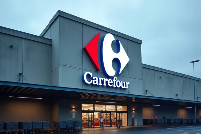
Why the hidden C of the Carrefour logo remains effective after six decades
Many logos from that era have been redesigned multiple times. The Carrefour logo has undergone minor adjustments (typography, proportions) but the structure of the two arrows and the C in negative space has never changed. This stability is a textbook case in visual identity.
Three factors explain the longevity of the logo:
- The negative space creates a “discovery effect” that generates attachment. When one finally notices the C, it feels like uncovering a secret, which anchors the brand in memory.
- The logo works without the name. In a parking lot or on a facade, the two arrows are sufficient. This graphic autonomy is rare among large retail brands.
- The geometric simplicity (two rounded triangular shapes) ensures faithful reproduction across all media, from plastic bags to mobile apps.
This same principle of negative space can be found in other famous brands (the arrow between the E and the x of FedEx, for example), but the Carrefour logo has the distinction of hiding the complete initial of the brand, not just a secondary symbol.
The logo designed in 1966 remains the distinctive sign of a brand present in several dozen countries. Its strength lies in a simple paradox: the more you look at it without seeing it, the better it works. The white C does not need to be consciously perceived for the brain to register the brand. It is precisely this mechanism that makes the Carrefour logo one of the most studied examples in graphic design.